
How to Edit and Adjust Mobile
This article is about how to customize your mobile menu in Squarespace.
*🖼️ You will find screenshots for each step, customized to the specific template you've chosen.
🌈 Doing this is actually super simple, you just need to know where to look for everything!
From any page on your site:
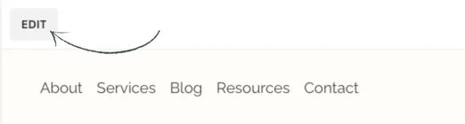
Go to edit mode.
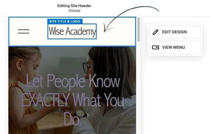
At the very top right of your screen, click into Mobile View.
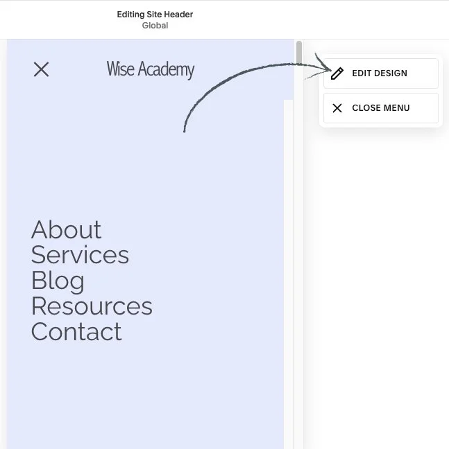
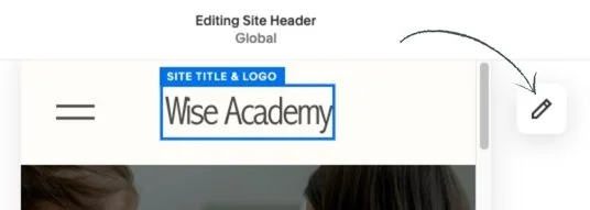
Hover over the very top of your Mobile screen and click Edit Site Header.


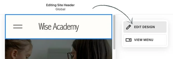
4. Click Edit Design, and there is where you can customize the layout of your Mobile menu.
5. Click on the drop- down menu. You'll be able to choose from a few different layouts. Choose one.
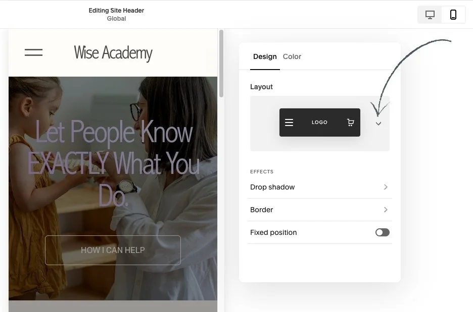
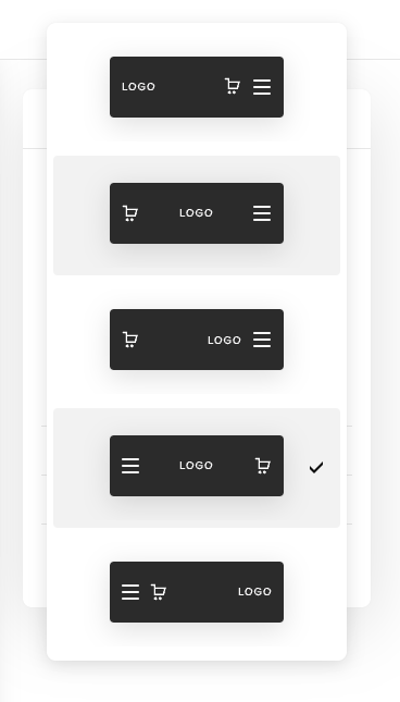
• You can see it change up at the top.
This is just going to be the order of your logo or site title, your menu icon, and any other additional features that you enable for your menu.
• You'll then have the option to apply a few different effects to your menu:
Drop shadow, a Border, or making it Fixed position which will keep your menu at the top of the screen as you scroll up and down.


👀 However, it's really important to know that these settings are not independent from Desktop View, that means that if you make any changes to the Drop shadow, the Border or if you make your entire menu a Fixed position, that's also going to apply to the Desktop View. The same goes for editing any colors.
• Underneath the Color tab you can choose to have your menu be Adaptive, to show a Gradient, or to create just a Solid colored menu.
• Once you're happy with your layout:
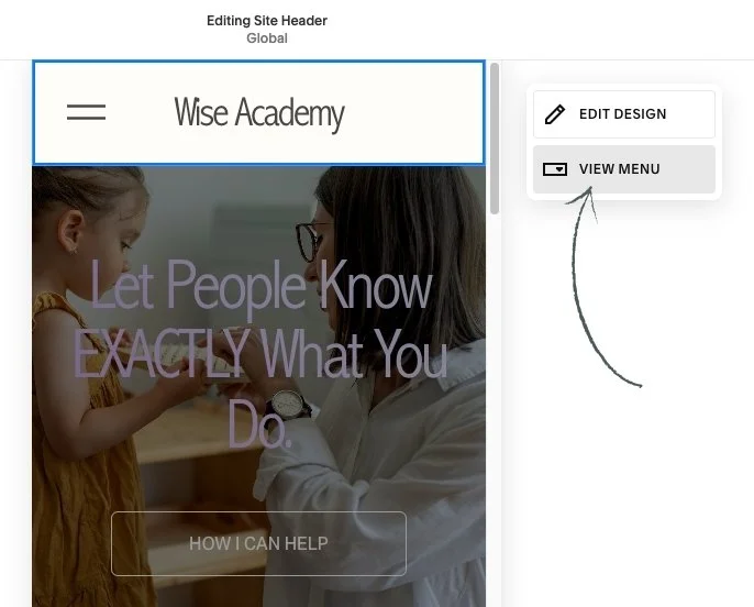
Click out of this menu. Simply click anywhere on the page that is not within the settings pop up area.
Click into where it says View Menu. This is going to show you what your actual Mobile menu is going to look like.
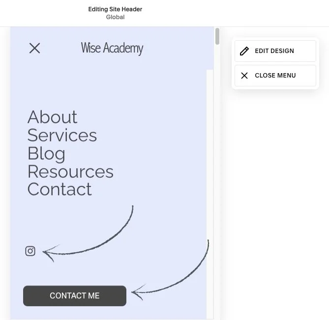
Click into Edit Design again to make some customizations.
• Under Alignment, you can change the alignment of the actual items in your menu: center, right or left.
• You can also edit the Link Spacing with the slide bar.
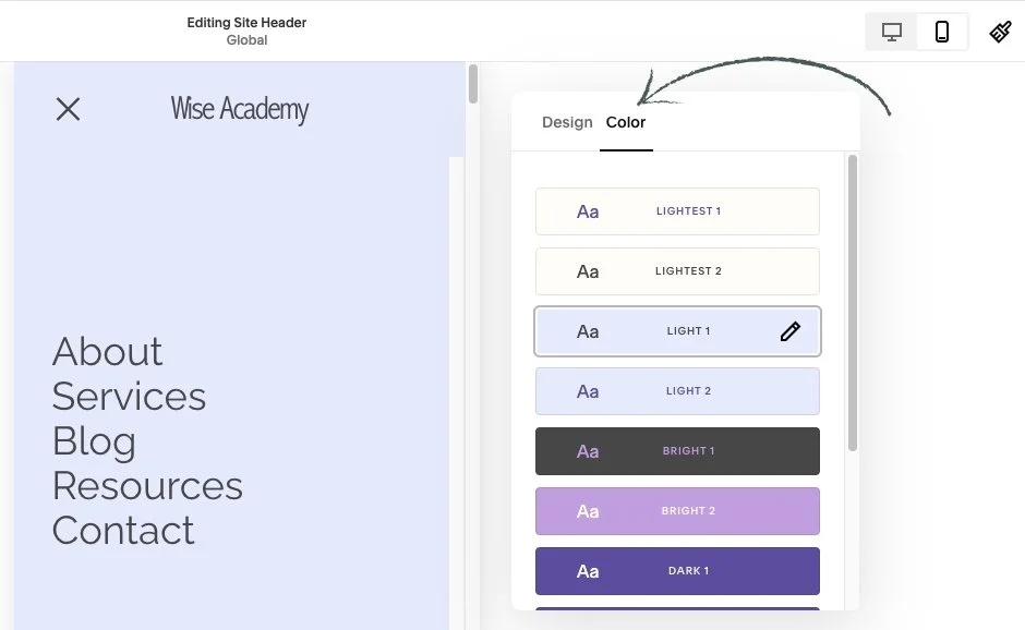
• If you want to change the color of your menu:
Click into the Color tab and choose from one of the Themes set by your color Palette.
🖌️ As a reminder: to edit these Themes you can just head into your Site Styles which is the Paint brush icon in the very top right of your screen and then click into Colors.
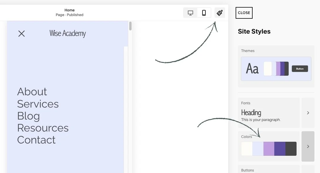
• From there you can:
Find the Color Theme that you want to use or that you already have selected.
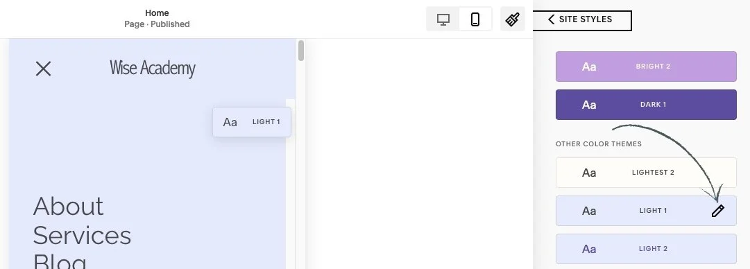
Click the little pencil edit icon to the right.
Scroll down until you find the section titled Menu Overlay.
And there you can go ahead and play around with the colors of your palette.

💡 If you want to customize your mobile menu further by adjusting the font of your menu links, it's important to note that this menu font uses whatever you have already set as your paragraph font in your site Styles. So any changes that you make is going to apply sitewide.
• Click out of your Site Styles panel by clicking the paint brush again and be sure to save your work.
• Additional icons and elements to your mobile menu:
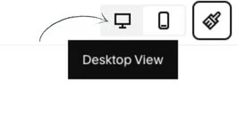
Click back onto Desktop View icon in the top right-hand corner.
Hover over your Header and click Edit Site Header.
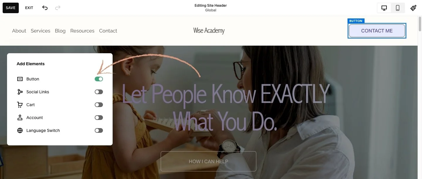
Click on Add Elements button to the very left.


• This is where you can add some additional elements like a Button, Social Links, a Shopping Cart, an Account login, and even Language Switch if you have a multilingual website.
• If you want to add any of these elements to your menu:
Go ahead and toggle them on and you'll see them appear in your menu.
💡 It's important to keep in mind that toggling on any of these elements will make them display in both the Desktop View menu as well as your Mobile View; so it's not only independent to mobile or desktop, it'll appear on both.
Once you're happy with what you have added to your menu, you can go ahead and click out of the Add Elements popup window.
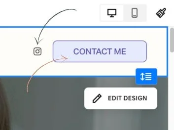
• You can customize any of the additional icons and elements just like you would on a regular block on your website:
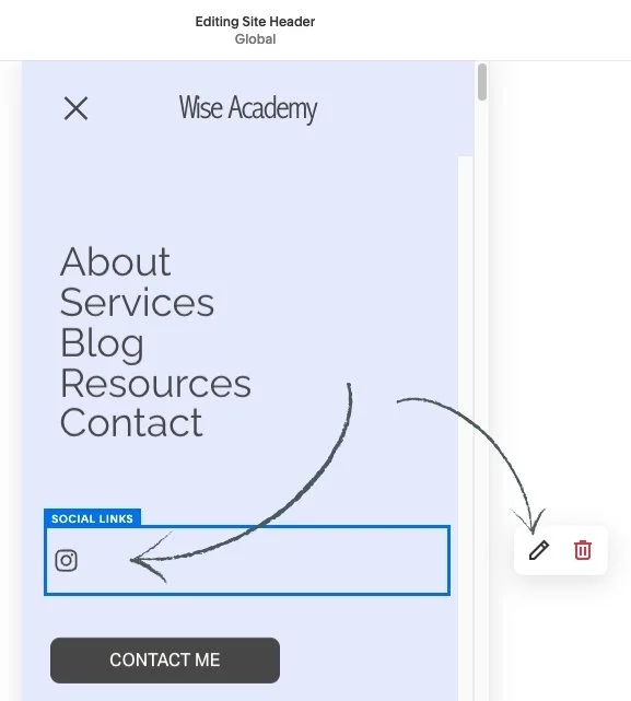
Go back into Mobile view.
Click View Menu, and now you can see the Social Icon and the Button display.
3. Click on the Block and then click on the pencil edit icon.
There you can adjust your links. If you click into design you can go ahead and adjust the size and the shape of your links.
• If you've chosen to add a Button to your menu you can also adjust the Style Settings.
⭐️ As a reminder: to adjust these settings you can just head into your Site Styles which is the paint brush icon in the very top right of your screen and then click into Buttons.


• Make sure that you're clicked into the Primary Button before making any customizations. This is the header button that is going to take the properties of.
👀 Remember that making any changes here is going to apply to any Primary Button that you have around your entire website.


• Adjusting the Mobile Menu Icon:
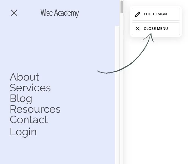
If you are viewing your full mobile menu be sure to click Close Menu and you'll now be able to see the little Menu Icon.
Hover over it. It should say Menu.
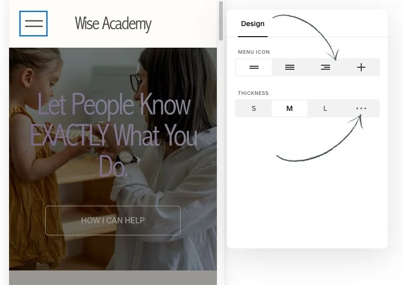
Click into this block and then click the pencil edit icon.

• There you'll find some additional design settings you can choose from:
Different shapes for the icon.
Different thickness levels for the lines. You can click the three dots to adjust the thickness level.
• Adjustments to your Site Title and Logo area:
Hover over either your Site Title or your custom Logo.
Click into this block and then click the pencil edit icon.
• This is where you can adjust your Site Title and add your custom Logo.
⭐️ Remember that these two things (little Menu icon and Logo) are not independent to just mobile, so if you make any changes to these it will change on both mobile and desktop.
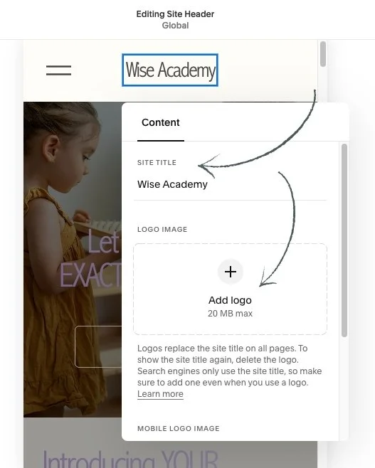
💡 The one thing that is independent to mobile is your Mobile Logo Image.
• At the very bottom of this popup window is an area for you to upload a unique image or logo just for mobile view.
This comes in really handy if you have a super large image that's on desktop and you want something a little bit more paired down or an icon for mobile.
You can go ahead and do that there and just remember that it's always still important to include a Site Title if you are uploading a unique logo, because it helps boost your SEO.

🔸 As always be sure to save your changes when you are finished editing.